Submit
In interaction web forms, a submit element displays the 'Continue' and 'Reset' buttons.
This is automatically added when an interaction exits in the await state. You do not need to do it yourself.
start:
  await:
    form:
      elements: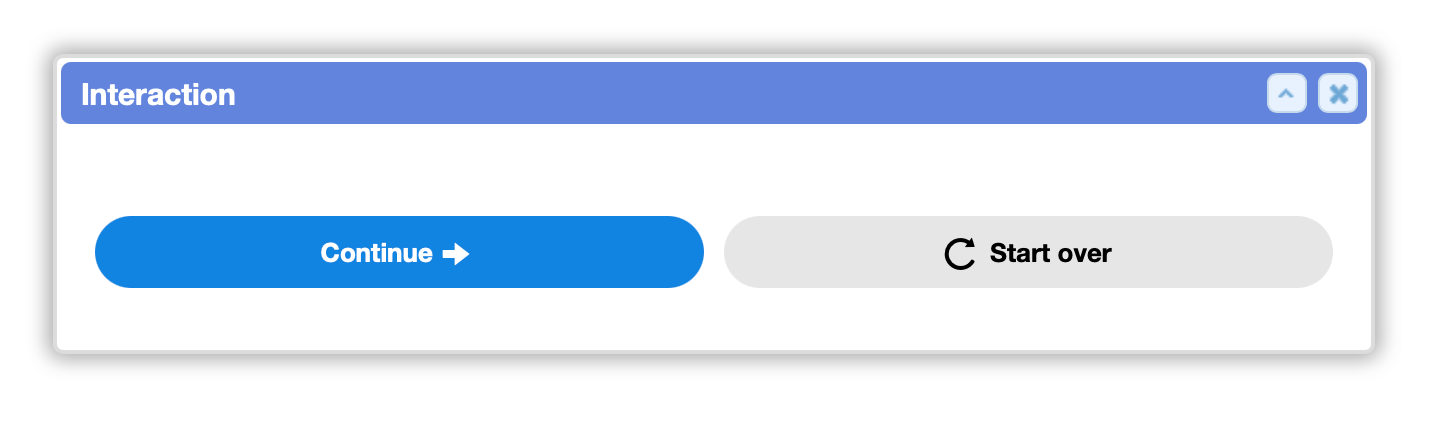
Syntax
buttons:
A submit: element may optionally specify any number of custom buttons.
Custom buttons can provide label, icon, icon position, style, and value. Each button is either a continue: or reset: type.
When clicked, a continue: button sets the submit: element's key to its value.
There may be multiple continue buttons (e.g. yes/no, allow/deny). This is much simpler than using a sheet, and it no longer requires a second click to continue.
When submit:buttons: isn't provided, the default 'continue' and 'reset' buttons are automatically added; and these can still be controlled with the submit:continue@bool: and submit:reset@bool: shortcuts.
The current alternative styles for buttons are 'secondary' (gray like reset) or 'outline' (blue like continue but not filled). This makes it easy to visually distinguish primary/default and secondary options.
start:
  await:
    form:
      title: Confirmation
      elements:
        say:
          content: # Are you sure?
        submit/prompt_confirm:
          buttons:
            continue/yes:
              label: Yes
              value: yes
            continue/no:
              label: No
              style: secondary
              value: no
              hidden@bool: no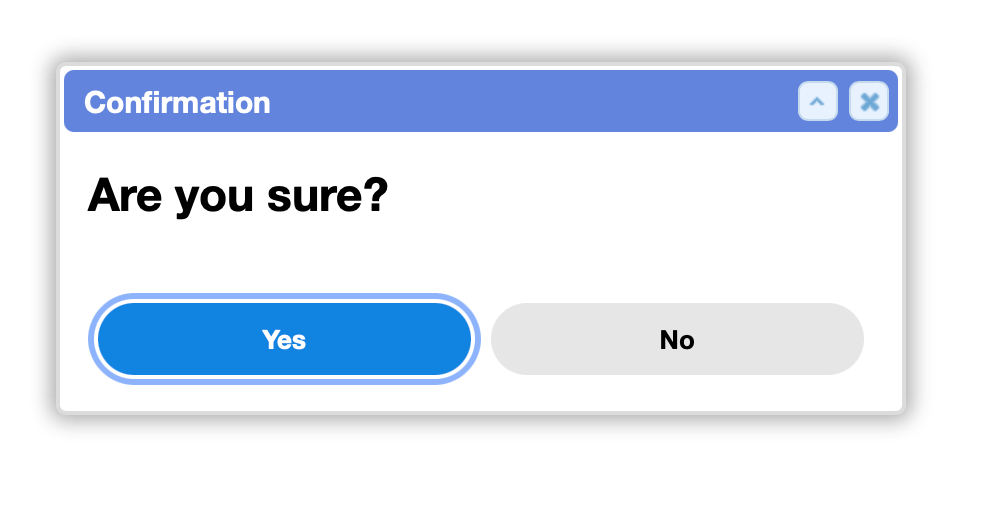
hidden:
This form element can be conditionally hidden.
hidden@bool: {{not worker_is_superuser}}is_automatic:
If true, the form is automatically submitted. This is primarily useful in place of await:duration: before a long-running action.
is_automatic@bool: yes