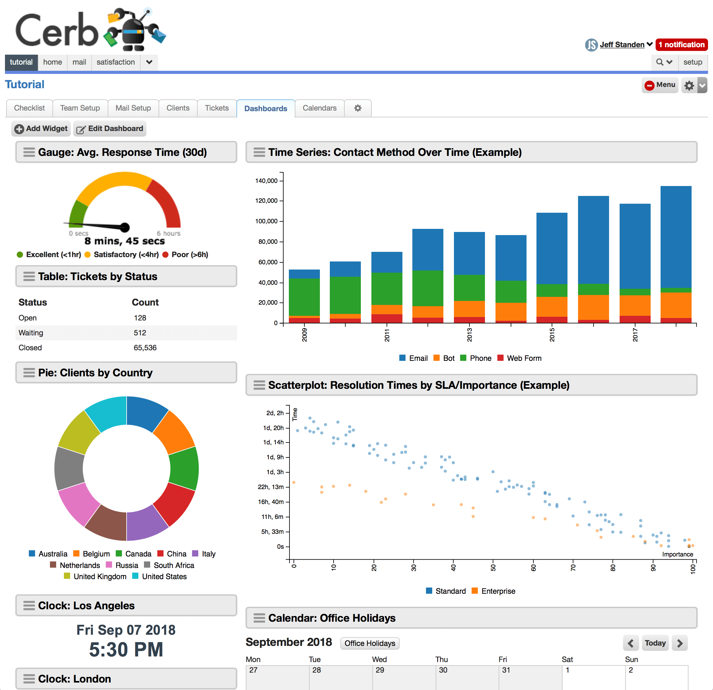
Dashboards
Visual insight from highly customizable widgets
Dashboards provide visual insight with collections of highly customizable widgets. Most widgets take a data query as input.
Dashboards are responsive – they automatically adapt to various screen sizes on different devices. If you have a narrow screen like a smartphone held vertically, you may only be able to display a single column of widgets. On a much larger desktop display, the same dashboard could display multiple horizontal columns of widgets.
Widgets can have different sizes relative to each other. For example, a large chart may be configured to display 2X-4X as wide as the widgets adjacent to it when that much space is available.
By configuring the layout of a dashboard, different zones become available for widgets to use. For instance, two zones could be a left-hand sidebar and a larger content area to the right of it. Widgets determine their size based on the zone they are in. These zones will also collapse to a single column when a device's screen is too narrow.
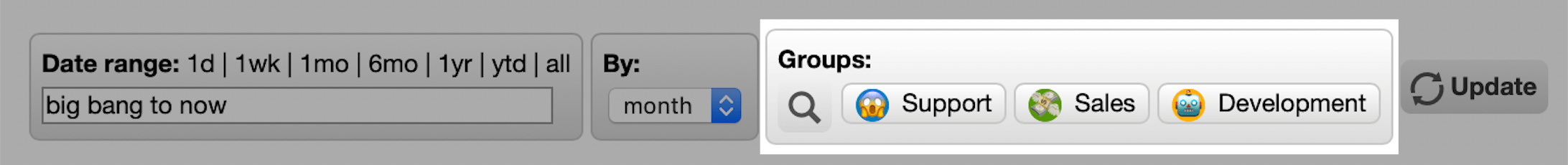
Prompts
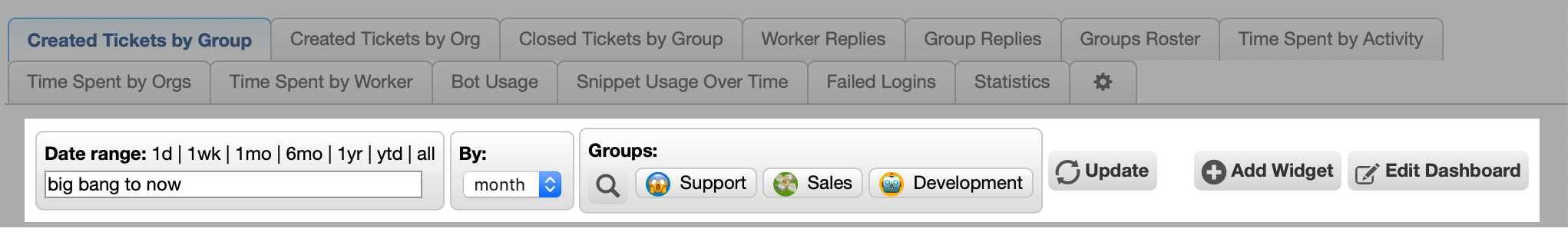
As of 9.0.4, user-editable custom prompts can be added to the top of workspace dashboards. These prompts automatically apply to all the dashboard's widgets. Previously, each widget had to be filtered individually.
Each dashboard prompt is associated with a new placeholder that can be used when configuring queries widgets (e.g. search queries, data queries).
For example, a reporting dashboard can provide prompts for a date range, date grouping (e.g. year/month/day), and a specific list of workers. Its various charts and worklists will adapt in real-time to changes in those prompts from a single place.
The current state of a dashboard's prompts is remembered per worker between pages (and sessions). The owner of the dashboard configures the initial defaults for each prompt.
Configuring dashboard prompts
Dashboard prompts are configured on a dashboard by clicking the Edit Dashboard button.
They are defined by using a very simple text-based format known as KATA:
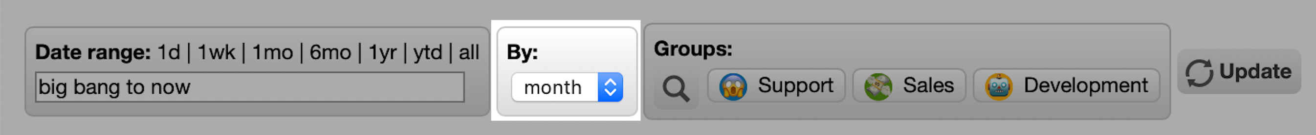
date_range/input_date_range:
  label: Date range:
  default: first day of this month -12 months

picklist/input_date_subtotal_by:
  label: By:
  default: month
  params:
    options@list:
      hour
      day
      week
      month
      year

picklist/input_statuses:
  label: Statuses:
  params:
    multiple: yes
    options@list:
      open
      waiting
      closed
      deleted

chooser/input_groups:
  label: Groups:
  default@json: null
  params:
    context: group
    single: no

text/input_keywords:
  label: Keywords:
  default@json: null
This is a tree of key: value pairs.
The top-level keys describe the prompts with the format: {type}/{placeholder}:
The possible prompt types are:
The placeholder is the name of this prompt when used in queries on dashboard widgets. This should be a lowercase string containing only letters, numbers, and underscores (_).
Each filter may have the following keys:
-
label: The human-friendly name of this prompt.
-
default: The default value of this prompt when the dashboard is viewed for the first time by a worker.
-
params: An optional list of parameters based on the prompt type. This is another set of
key: valuepairs indented with two leading spaces.
Prompt types
chooser
When prompting with a chooser, the user selects one or more records using a helper popup.
chooser/input_groups:
  label: Groups:
  default@json: null
  params:
    context: group
    query@text: id:>0
    single: no
The available params: are:
-
context: a record type alias.
-
query: a search query to filter the worklist popup.
-
single:
yesfor single record selection,no(default) for multiple.
The value of the placeholder is a comma-separated list of record IDs. You'd use it in a query like:
type:worklist.subtotals
of:tickets
by:[created@month,group]
query:(
	created:"-1 year to now"
	{% if input_groups %}
	group.id:[{{input_groups}}]
	{% endif %}
)
format:timeseries
If a chooser prompt's name ends in _id then its placeholder will support key expansion. For instance, a prompt named prompt_worker_id can also access prompt_worker_first_name.
date_range
When prompting with a date range, the user enters a start and end date (inclusive). One-click presets are provided for common ranges (e.g. past day/month/year). The dates can be absolute (e.g. 2019-12-31, Jan 1 2019) or relative (e.g. -1 year, today, now, next Friday, first day of this month -1 year).
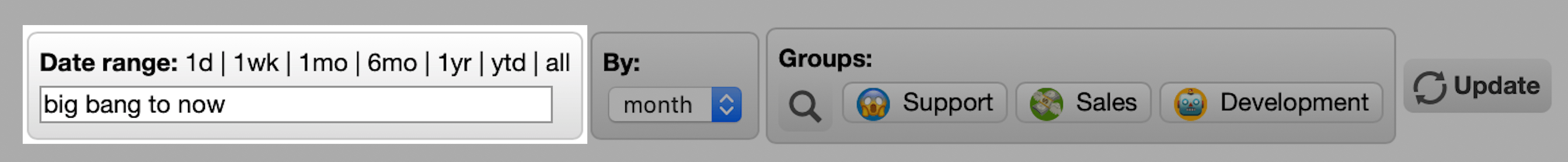
date_range/input_date_range:
  label: Date range:
  default: -1 month to now
  params:
    presets:
      1d:
        label: today
        query: today to now
      1mo:
        query: -1 month
      ytd:
        query: jan 1 to now
      all:
        query: big bang to now
The available params: are:
- presets: an optional list of date range presets. If omitted the built-in defaults will be used.
The value of the placeholder is a text string with format "date1 to date2". This is suitable for passing directly to any date-based filters. Be sure you wrap it in quotes (" ").
type:worklist.subtotals
of:tickets
by:[created@month,group~10]
query:(
	created:"{{input_date_range}}"
)
format:timeseries
picklist
When prompting with a picklist, the user selects one item from a pre-defined list of options.
picklist/input_date_subtotal_by:
  label: By:
  default: month
  params:
    options@list:
      hour
      day
      week
      month
      year
The available params: are:
-
multiple:
yesif multiple selection is enabled,no(default) otherwise. -
options: a list of possible values for the picklist.
params:
  options@csv: day, week, month, year
params:
options@list:
day
week
month
yearAs of [9.1.3](/releases/9.1.3/) you can also provide a map of labels and values:
params:
  options:
    Open: o
    Waiting: w
    Closed: c
    Deleted: d
In single selection mode (multiple: no), the value of the placeholder is the selected option:
type:worklist.subtotals
of:tickets
by:[created@{{input_date_subtotal_by}},group~10]
query:(
	created:"first day of this month -1 year to now"
)
format:timeseries
In multiple selection mode (multiple: yes), the value of the placeholder is an array of selected options:
type:worklist.subtotals
of:tickets
by:[created@day,group~10]
query:(
	created:"first day of this month -1 year to now"
	{% if input_statuses %}
	status:[{{input_statuses|join(',')}}]
	{% endif %}
	status:[]
)
format:timeseries
text
When prompting with text input, the user enters freeform text.
text/input_subject:
  label: Search:
  default: some example text
  params:
    hidden@bool: no
The optional params: are:
- hidden@bool:
yesif the text field should be hidden,no(default) otherwise. A hidden text field can be used as a shared configuration value on multiple widgets.
The value of the placeholder is a text string. This is suitable for passing directly to any filters. Be sure you wrap it in quotes.
type:worklist.records
of:tickets
query:(
	{% if input_subject %}
	subject:"{{input_subject}}"
	{% endif %}
)
format:dictionaries
Widgets
| Type | Description |
|---|---|
| Automation | |
| Calendar | A calendar widget with dates and events. |
| Chart KATA | A highly customizable chart combining multiple datasources from data queries and automations. |
| Chart: Pie | |
| Chart: Time Blocks | A heatmap-style chart useful for availability visualizations. |
| Chart: Time Series | A chart used for visualizing changes over time. |
| Clock | A clock widget with a configurable timezone and format (12/24-hr). |
| Countdown | |
| Counter | |
| Interactions Toolbar | A toolbar widget for running worker interactions. |
| Knowledgebase Browser | |
| Map | A map widget that displays interactive geographic visualizations with regions and data points. |
| Project Board | A project board that visually organizes and automates multi-step processes. |
| Record Fields | A widget that displays field metadata for record types. |
| Sheet | A highly customizable data grid tool for displaying records. |
| Worklist | A record worklist with configurable search queries and columns. |