Sheets
A text-based grammar for building rich data grids
Sheets are a modern, automation-friendly data visualization that avoids the schematic rigidity of worklists. A sheet is still a collection of rows and columns, but its column are defined in a fully customizable KATA-based text schema. This text-based schema can live within a bot behavior or widget without having to be previously defined or saved.
Each column in a sheet has a type (e.g. card, date, text) with configurable options.
A cell (the intersection of a specific row and column) doesn't have to relate to a schema field at all – it can be a synthetic or computed value, translation, interactive element, deep-linked field, arbitrary output, etc.
Sheets use placeholder dictionaries to to render cells, and they receive their input from any data query that can generate dictionaries – including worklist.subtotals and a new worklist.records data query type that significantly simplifies fetching record data. This means that sheets can also easily format and display data from third-party APIs. The data query itself, being text, supports placeholders and bot scripting logic – so you can determine which columns are available, or what a cell displays, based not only on aspects of the record, but also based on on who is looking at it, their permissions, etc.
State on sheets is maintained client-side, and paging/sorting/filtering is customized for the use case (e.g. bot interaction vs portal vs dashboard widget) – essentially just passing simple information to the input data query.
For example, this data query:
type:worklist.records
of:ticket
query:(status:open limit:5)
expand:[initial_message_sender_org_,owner_]
format:dictionaries
And this sheet schema:
layout:
  style: table
  headings: yes
  paging: yes
  title_column: _label

columns:
  card/_label:
    label: Ticket
    params:
      bold@bool: no

  card/initial_message_sender__label:
    label: Requester
    params:
      underline@bool: no

  text/initial_message_sender_org_country:
    label: Country

  text/group__label:
    label: Group / Bucket
    params:
      value_template@raw: {{group__label}} / {{bucket__label}}

  card/owner__label:
    label: Owner
    params:
      image@bool: yes
      underline@bool: no

  slider/importance:

  date/updated:
    label: Updated
    params:
      format: Y-m-d
Will display this sheet:
Unlike a worklist that is limited to records, the results of the data query above could have come from anywhere (third-party API call, subtotals, computation). As text, sheets can be quickly modified and shared, retrieved from the API, or constructed dynamically by bots.
You'll also notice that we're displaying the country of the initial sender's organization as a column. The group and bucket are displayed as a single column. We're selecting which columns to show cards and profile images for. We're changing the date format. None of this was possible with worklists.
Layout
Styles
Tables
By default, sheets display as a table of rows and columns.
layout:
  style: table
To specify fixed column widths:
layout:
  style: table
  params:
    column_widths:
      description: 70%

columns:
  text/name:
  text/description:
Fieldsets
The fieldsets layout style displays rows as fieldsets (vertically) rather than a table (horizontal). This is useful on profiles to summarize a single record, and in mobile environments.
layout:
  style: fieldsets
Columns
The columns layout displays rows as equal width columns.
layout:
  style: columns
Grid
The grid layout displays rows as a dynamically sized grid.
layout:
  style: grid
Buttons
The buttons layout displays rows as buttons. This also supports one-click continue in interactions.
layout:
  style: buttons
Colors
Color palettes for use with color: and text_color: in columns.
When used with the @raw annotation, the value may contain scripting and row placeholders. The value should be the key of a color set defined in layout:colors: as a list of HEX color codes (e.g. #ffcc00). The value may contain a :n suffix, where n is the 0-based index from the color set. This can be done dynamically for threshold colors.
By default, the first color is used.
If a color set contains a _dark suffix, it will be used automatically in dark mode (e.g. rainbow12 will check for the existence of rainbow12_dark).
Entire rows can be colorized by using the same color: parameter on all columns.
layout:
  colors:
    rainbow12@csv: #6e40aa, #b83cb0, #f6478d, #ff6956, #f59f30, #c4d93e, #83f557, #38f17a, #19d3b5, #29a0dd, #5069d9, #6e40aa
columns:
  text/example:
    params:
      color: rainbow12:0
      text_color: rainbow12:1
Columns
The following properties are available on all columns:
color: |
The cell's background color from layout:colors: (a suffix of :n selects a particular 0-based color index) |
text_align: |
The cell's text alignment: left, center, or right. |
text_color: |
The cell's text color from layout:colors: (a suffix of :n selects a particular 0-based color index) |
text_size: |
This cell's text size as a numeric percentage (e.g. text_size: 150). This is particularly useful with layout:style: fieldsets when rendering cards. |
Card
The card column type displays a link that opens the card popup for a particular record.
The record to display is specified with the context: and id: params for a static record (e.g. task:123), or context_key: and id_key: for displaying a dynamic record based on dictionary keys. If omitted, this defaults to the current record using context_key: _context and id_key: id. If key: ends with _id or _label (e.g. group__label) then Cerb will attempt to automatically figure out the context, id, and label by using the dictionary.
This is also capable of displaying cards for deeply-nested related records (e.g. ticket » latest message » sender » org » email).
Similarly, the label for the link can be specified using label: (static) or label_key: (dynamic).
If an image: true param is provided, a profile image will be displayed to the left of the link.
The bold: and underline: params control how the link is displayed.
The icon: parameter has the same options as an icon column.
columns:
  card/name:
    label: Name
    params:
      context_key: _context
      id_key: id
      label_key: _label
      image: yes
      bold: yes
      underline: yes
      #icon:
      #  image: circle-ok
Code
The code column type displays code fragments with a fixed-width font and syntax highlighting.
The syntax: parameter may be one of:
plaintext |
No syntax (default) |
diff |
Unified diff |
columns:
  code/toolbar_kata:
    label: Code
    params:
      syntax: kata
      value_key: toolbar_kata
Date
The date column type displays a datetime in various formats. The default is a relative timestamp (e.g. "2 hours ago"). An arbitrary format: may be specified using options from http://php.net/date.
The timestamp can be provided as value: (a Unix timestamp in seconds) or value_key: (a dictionary key containing a Unix timestamp). When both of these are omitted, the key: is used.
columns:
  date/updated:
    label: Updated
    params:
      # See: https://php.net/date
      format: d-M-Y H:i:s T
      #value: 1577836800
      #value_key: updated
Icon
The icon column type displays an icon image, record profile image, or automation resource.
You'll find a list of icon names in Setup » Developers » Icon Reference.
columns:
  icon/can_sign:
    label: Sign
    params:
      #image: circle-ok
      #image_key: icon_key
      image_template@raw:
        {% if can_sign %}
        circle-ok
        {% endif %}
record_uri:
Optionally, a record_uri: key can contain a record URI value (cerb:<record_type>:<id>). This will display its profile image as the icon.
The record_uri: may also be an image-based automation_resource token.
If both record_uri: and image: are defined, the former will be checked first and if empty fall back to the latter.
columns:
  icon/group:
    label: Group
    params:
      record_uri: cerb:group:123
svg:
Render arbitrary in-line SVG images with the svg: key. Rendered SVG images are automatically sanitized.
This is particularly useful for dynamic or single-use images. For instance, a survey could display happy/sad or thumbs up/down images on buttons.
columns:
  icon/group:
    label: Group
    params:
      svg:
        data@text:
          <svg xmlns="http://www.w3.org/2000/svg" width="500" viewBox="0 0 240 135">
          ...
          </svg>
Interaction
The interaction column type triggers an interaction when clicked.
columns:
  interaction/ip:
    label: IP
    params:
      uri: cerb:automation:wgm.interaction.locationByIP
      text_template@raw: {{row.source_ip}}
      inputs:
        ip@raw: {{row.source_ip}}
      #image: circle-ok
Link
The link column type displays a relative or external link with some text.
Params:
| Key | Description |
|---|---|
href: |
The static URL to open. This can be a relative path (e.g. /path/to/page) or an absolute path (e.g. https://cerb.ai/) |
href_key: |
The dynamic key with a URL to open. |
href_template@raw: |
A script that outputs a URL to open with placeholders for each row. |
href_new_tab@bool: |
If yes the link opens in a new tab, otherwise it opens in the current tab (default). |
icon: |
An icon to display adjacent to the link text (e.g. new-window-alt). |
icon_at: |
start or end |
text: |
The static label of the link. |
text_key: |
The dynamic key with the label of the link. |
text_template@raw: |
A script that outputs a label for the link with placeholders for each row. |
columns:
  link/link:
    label: Link
    params:
      #href: https://example.com/
      href_key: record_url
      #href_template@raw: /profiles/task/{{id}}-{{title|permalink}}
      #text: Link title
      text_key: _label
      #text_template@raw: {{title}}
Markdown
The markdown column type displays Markdown formatted text as HTML.
columns:
  markdown/content:
    label: Answer
Search
The search column type displays arbitrary text as a link with label: or (label_key:, label_template:).
Clicking the links runs search query: (or query_key:, query_template:) against context: (or context_key:, context_template:) records.
For instance, a table of calculated results could open a search popup to the source data.
The icon: parameter has the same options as an icon column.
columns:
  search/count:
    label: Count
    params:
      context: ticket
      #query_key: query
      query_template@raw: owner.id:{{id}}
Search Button
The search_button column type displays a search button that opens a worklist popup with the results of a query for a given record type.
The record type to search is specified in the context: param (or context_key:, context_template:).
The query: (or query_key:, query_template:) param contains the search query.
The label: (or label_key:, label_template:) param provides the text of the search link.
columns:
  search_button/assignments_search:
    label: Assignments
    params:
      context: ticket
      #query_key: query
      query_template@raw: owner.id:{{id}}
Selection
The selection column type allows single and multiple selection of sheet rows. This is useful when a sheet has a toolbar or is displayed in an interaction.
The selected rows will add their value: (or value_key:, value_template:) to a placeholder. When omitted, the default value is the placeholder matching the column's name.
The mode: parameter controls whether single or multiple selection is used.
columns:
  selection/id:
    params:
      mode: single
      #mode: multiple
      #label: Label
      #label_key: label
      #label_template@raw: {{label}}
      #value: 123
      #value_key: id
      #value_template@raw: {{id}}
Slider
The slider column type visually displays a value: (or value_key:, value_template:) on a continuum with configurable min: and max: bounds. The output is similar to the "Importance" column on ticket/task worklists.
Use the show_labels: yes option to show the min and max values on either side of the slider. This defaults to no.
Specify custom threshold_colors: to override the defaults. This is a map with limits as keys and colors as values.
columns:
  slider/importance:
    label: Importance
    params:
      min: 0
      max: 100
      #value: 50
      #value_key: importance
      #value_template@raw: {{importance+10}}
      #show_labels@bool: no
Text
The text column type displays arbitrary text as value: (or value_key:, value_template:) using bot scripting and placeholders. The default value is the column's key: in the placeholder dictionary.
Text columns may include a value_map: parameter for associating new labels to values. For instance, "F => Female" or "1 => Yes". This reduces the need for custom columns.
The icon: parameter has the same options as an icon column.
This type is usually the default when no column type: is specified.
columns:
  text/gender:
    label: Gender
    params:
      #value: Female
      #value_key: gender
      #value_template@raw: {{gender}}
      value_map:
        F: Female
        M: Male
      #icon:
      #  image: circle-ok
Time Elapsed
The time_elapsed column type convert units of time (like seconds) into human-friendly dates (e.g. "2 hours, 5 mins").
The value: (or value_key:, value_template:) parameter specifies the value. If omitted, the value of the column key is used.
The precision parameter controls how granular the date is. For instance, precision: 3 is "2 hours, 5 minutes, 29 seconds". The default is 2.
columns:
  time_elapsed/elapsed_response_first:
    label: First Response
    params:
      precision: 2
Toolbar
The toolbar column type displays a toolbar for each row.
columns:
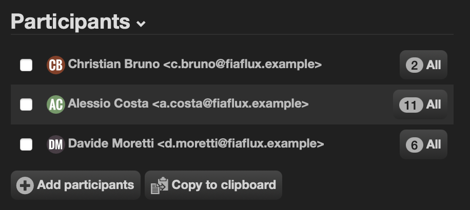
toolbar/_toolbar:
label: Tickets
params:
text_align: right
kata:
interaction/name:
uri: cerb:automation:cerb.interaction.echo
badge@raw: {{ticket_count}}
label: All
inputs:
outputs:
search:
record_type: ticket
query@raw: participant.id:{{id}} subtotal:status
after:
refresh_widgets@bool: no