Chart KATA
The Chart KATA widget can build complex, dynamic charts with mixed visualizations and datasets from multiple sources. The datasets and chart schema are both defined using a KATA dialect.
Configuration
Datasets
A dataset is a collection of series data. An /identifier names the dataset.
Each series within a dataset has a unique key name containing an array of values.
For instance, a time-series dataset could include a series named ts with timestamps for the x-axis, and a second series named values with the y-axis values.
| Type | Description |
|---|---|
| automation: | Load data from an automation. Almost anything is possible here. |
| dataQuery: | Load data from a data query. |
| manual: | Static data. This is primarily useful in interactions where some chart data has already been loaded. |
automation:
Load series data from a ui.chart.data automation.
This can synthesize and preprocess chart data from anywhere: third-party APIs, Cerb records, business intelligence tools, etc.
automation/avgInflow:
  uri: cerb:automation:example.chartData.avgTicketInflows
  inputs:
    date_range: today to +4 weeks
  disabled@bool: no
dataQuery:
Load data from a data query.
dataQuery/tickets:
  query@text:
    type:worklist.subtotals
    of:ticket
    by:[created@month,group]
    query:(created:"this year")
    format:${format}
  query_params:
format: timeseries| Key | |
|---|---|
cache_secs@int: |
The number of seconds to cache the data query results. Use 0 to disable. |
key_map: |
Assign new names to any series in the dataset (e.g. yes -> # Outgoing Messages). This can be an object of keys (old labels) and values (new labels), or key_map@csv: Old Label 1, New Label 1. |
query: |
The data query to execute. |
query_params: |
An optional dictionary of untrusted parameters used in the data query. Reference like ${placeholderKey}. |
manual:
Load static data.
manual/series0:
data:
x@csv: 2022-01-01,2022-02-01,2022-03-01,2022-04-01
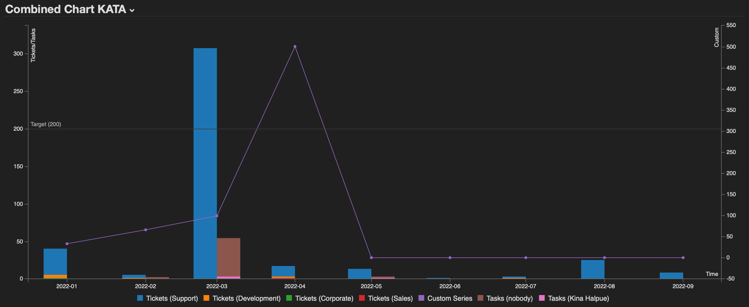
custom@csv: 33,66,99,500Chart
A {{datasets.name}} placeholder is available for each defined dataset.
For instance, a grid: line can be rendered from a dynamically computed value (e.g. average, threshold, goal).
| Key |
|---|
| axis: |
| color: |
| data: |
| grid: |
| legend: |
| tooltip: |
data:
  type: bar
  series:
    tickets:
      name: Tickets
      x_key: ts
    series0:
      name: Custom Series
      x_key: x
      y_axis: y2
      y_type: line
    tasks:
      name: Tasks
      x_key: ts
  stacks:
    0@csv: tickets
    1@csv: tasks

axis:
  x:
    label: Time
    type: timeseries
    tick:
      date:
        format: %Y-%m
  y:
    label: Tickets/Tasks
  y2:
    label: Custom

grid:
  y:
    lines:
      0:
        value: {{datasets.baseline.value}}
        text: Target ({{datasets.baseline.value}})
        position: start
axis:
| Key | |
|---|---|
x: |
By default, the horizontal axis on the bottom. |
y: |
By default, the vertical axis on the left. |
y2: |
An optional second vertical axis on the right. |
x:, y:, y2:
| Key | |
|---|---|
categories@list: |
If the axis is type: category, this is the optional preferred sort order. Otherwise, categories occur in the order they were defined. |
label: |
An optional label to display along the axis. |
tick: |
Options regarding measurement ticks. |
type: |
category, linear (default), or timeseries |
tick:
| Key | |
|---|---|
format: |
date:, duration:, or number: (default) |
tick:format:
| Key | |
|---|---|
date: |
A date format string using d3-time-format specifiers. For example: %Y-%m-%d %H:%M:%S |
duration: |
An elapsed time. |
number: |
A number string using d3-format specifiers. For example: $,.2 |
tick:format:duration:
| Key | |
|---|---|
unit: |
milliseconds, seconds, minutes, hours |
precision@int: |
The number of significant measures (e.g. 3 for 2d,5h,4m) |
color:
| Key | |
|---|---|
patterns: |
A dictionary of named hex color patterns. For example: rainbow12@csv: #6e40aa, #b83cb0, #f6478d, #ff6956, #f59f30, #c4d93e, #83f557, #38f17a, #19d3b5, #29a0dd, #5069d9, #6e40aa. |
Each dataset can specify a color pattern using data:series:*:color_pattern:.
Several pre-defined color patterns are available through code autocompletion.
If a pattern key ends in the _dark suffix it will be preferred in dark mode.
If a color pattern is named default it will apply to any series without an explicit color assigned.
If multiple datasets share the same non-default color pattern, colors will be synchronized for values that are identical. For instance, if two series compare groups over current/prior year, then 'Support' will have the same color in both datasets.
data:
| Key | |
|---|---|
series: |
A dictionary of datasets to display on the chart. |
stacks: |
A dictionary of datasets to stack (e.g. stacked bar). The keys can be anything as long as they're unique. e.g. 0@csv: dataset1, dataset2. |
type: |
The default visualization for all series on the chart. |
series:
Each series: key is a dataset name that may contain multiple series.
| Key | |
|---|---|
color_pattern: |
The color:patterns: scheme to use for this dataset. A pattern will repeat if there are more series than colors. When two datasets use the same pattern, the same series names will be assigned the same colors. |
name: |
A name to prepend to each series in the dataset. |
x_key: |
The series key used for the x-axis. For instance, timestamps on a timeseries axis, or labels on a category axis. |
y_axis: |
y (default) or y2. |
y_type: |
An optional type: for this dataset. For instance, you can overlay on line trend on a bar chart. |
type:
| Type |
|---|
area |
area-spline |
area-step |
bar |
donut |
gauge |
line |
pie |
scatter |
spline |
step |
grid:
| Key |
|---|
x: |
y: |
x:, y:
| Key |
|---|
lines: |
lines:
Each line must have a unique key name containing:
| Key | |
|---|---|
position: |
start, end |
text: |
The label to display on the line. |
value: |
The location on the given axis to draw the line. |
legend:
| Key | |
|---|---|
show@bool: |
no to hide the legend, otherwise visible (by default). |
style: |
compact (default) or table |
style:table:
| Key | |
|---|---|
data@bool: |
yes to show full data for the visualization, otherwise omitted (by default) |
stats@csv: |
Any combination of: sum, avg, min, max. Omitted by default. |
tooltip:
| Key | |
|---|---|
grouped@bool: |
no to show only the data point under the mouse cursor, otherwise everything with the same x-axis value is shown together. |
ratios@bool: |
yes to calculate ratios for series at each x-tick, otherwise hidden (by default) |
show@bool: |
no to hide mouse hover tooltips over data points, otherwise visible (by default) |
Examples
Timeseries: Stacked bar of tickets created this year by group
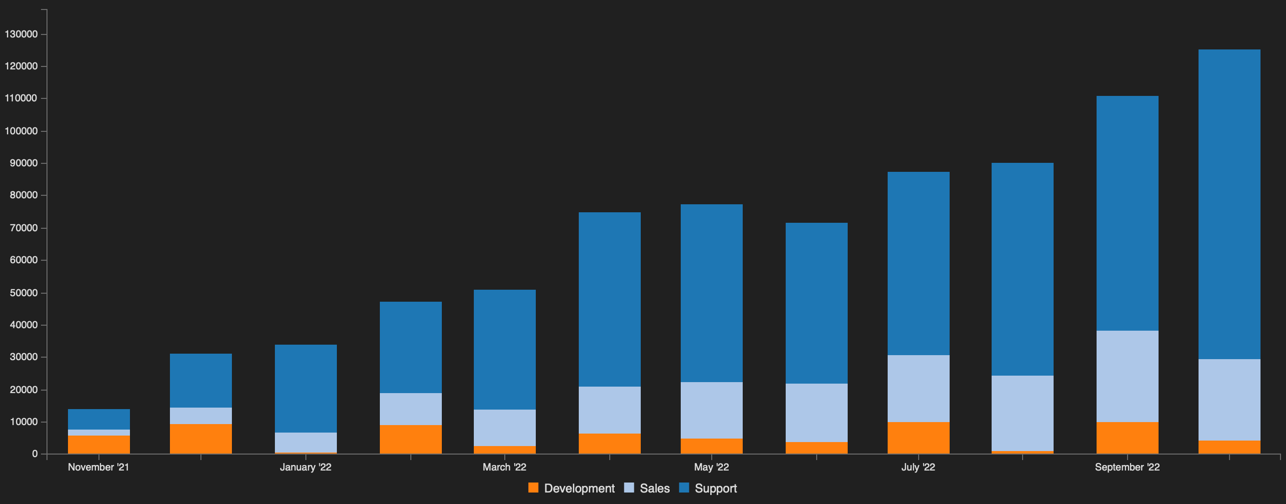
Datasets:
dataQuery/tickets:
  query@text:
    type:worklist.subtotals
    of:ticket
    by.count:[created@month,group]
    query:(created:"first day of this month -1 year")
    format:timeseries
Chart:
data:
  type: bar
  series:
    tickets:
      x_key: ts
  stacks:
    0@csv: tickets

axis:
  x:
    type: timeseries
    tick:
      format: %B '%y

tooltip:
  grouped@bool: no
Timeseries: Line comparison of contact methods
Datasets:
dataQuery/calls:
  query@text:
    type:worklist.subtotals
    of:call
    by:[created@year]
    format: timeseries

dataQuery/tasks:
  query@text:
    type:worklist.subtotals
    of:task
    by:[created@year]
    format: timeseries

dataQuery/tickets:
  query@text:
    type:worklist.subtotals
    of:ticket
    by:[created@year]
    query:(status:!d)
    format: timeseries
Chart:
data:
  type: line
  series:
    tickets:
      x_key: ts
      name: Tickets
    tasks:
      x_key: ts
      name: Tasks
    calls:
      x_key: ts
      name: Calls

axis:
  x:
    type: timeseries
    tick:
      format: %Y

tooltip:
  grouped@bool: no
Pie: Tickets created this year by bucket
Datasets:
dataQuery/tickets:
  query@text:
    type:worklist.subtotals
    of:ticket
    by.count:[group_bucket]
    query:(created:"this year")
    format:pie
Chart:
data:
type: pie
series:
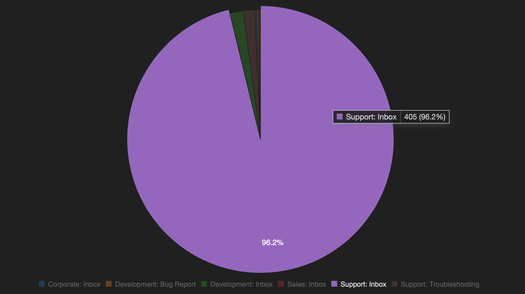
tickets:Donut: Contact methods
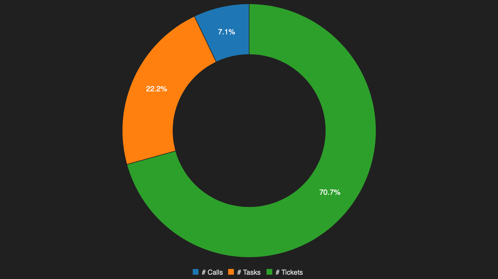
Datasets:
dataQuery/calls:
  query@text:
    type:worklist.metrics
    values.calls:(
      of:call
      function:count
      field:id
      query:()
    )
    format: pie

dataQuery/tasks:
  query@text:
    type:worklist.metrics
    values.tasks:(
      of:task
      function:count
      field:id
      query:()
    )
    format: pie

dataQuery/tickets:
  query@text:
    type:worklist.metrics
    values.tickets:(
      of:ticket
      function:count
      field:id
      query:(status:!d)
    )
    format: pie
Chart:
data:
  type: donut
  series:
    calls:
      name: # Calls
    tasks:
      name: # Tasks
    tickets:
      name: # Tickets